Sharon Howard joined the Beyond Notability project in August 2023 as Research Fellow in Digital Humanities. As a historian who can work with data Sharon has a rather specialist skill set. Sharon has had a hugely productive year, and this post is an attempt to pull together the various threads.
When putting together the Beyond Notability project, Katherine, Amara, and I envisaged that this Research Felow role would focus on helping our user communities cut through the data we were planning to create: to show the linkages in linked data; to provide big picture views on the histories of women’s work we were assembling; to create interactives that enabled both useful and playful engagements with evidence of committee membership, education, speaking engagements, life events, and all the various myriad of information we hoped we might find in the archive.
But when it got to time for Sharon to start, we knew that whilst we needed some of that, we also needed a data analysis-led approach to helping us understand the data that had been created. We had research questions that our rough SPARQL proficiency couldn’t grapple with. But even more pressing we had a sense that our data needed greater quality assurance.
This resulted in a series of admin queries that feed into data cleaning, for example: a list of end dates without start dates (and vice versa); the dates we have recorded as when women received degrees (because whilst Oxford started doing this in 1920 and Cambridge in 1948, they admitted women before these dates, which might have been confused in data entry); or women for whom we have plenty of information but were missing a date of birth and/or date of death.
Alongside this, Sharon also published a series of short blogs that cut across our data and provide insights both into some of the research questions we have and – importantly – the shape of our data. These include:
- a post on what kinds of degrees women attained, when, and from where; and a second on overlapping cohorts, which has some detailed data for UCL.
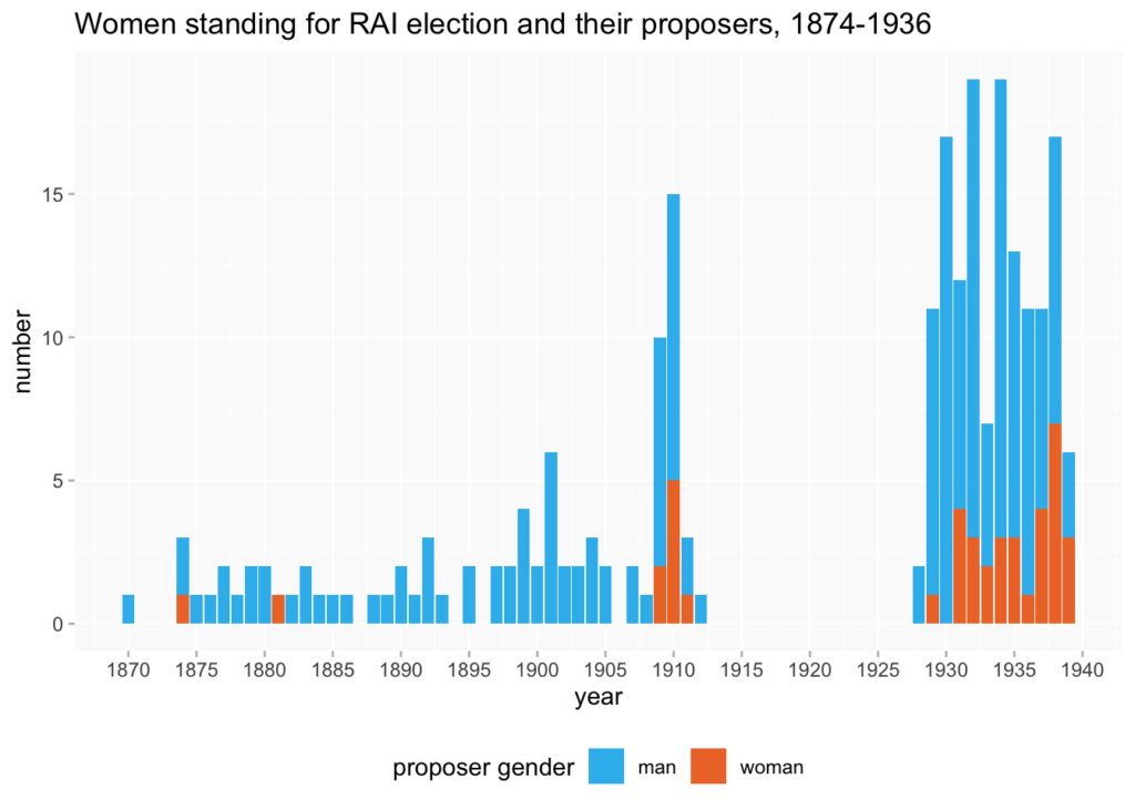
- a post on who supported women in getting elected as members of the Royal Archaeological Institute (which includes a notable gap where the records stop recording proposers).
- an interactive map showing where in London women in our database lived during the 1890s (which says something about their socio-economic status).
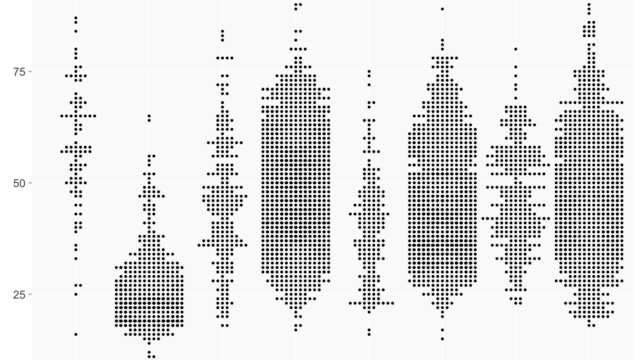
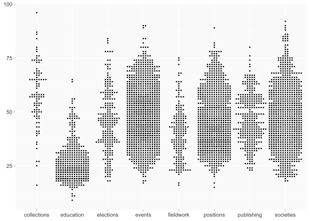
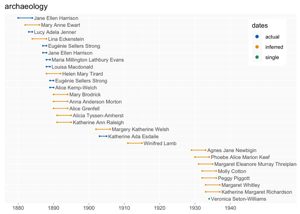
- and various visualisations of the kinds of public and professional activities (what we call PPAs) that women did, organised by date and age, the latter of which to draw attention to lifecourse.
As we draw towards the end of the project, Sharon and I are now extending this work in more experimental directions. Using Observable we plan to publish a series of interactives data visualisation with accompanying critical commentaries. These will tell stories with data and attempt to tease at and foreground the limitations of data-led work, with a focus on when the data we have shaped the interactives we can make (as in the example above of elections to the Royal Archaeological Institute) and on temporality. The latter has proven a particularly rich seam of thinking in the final months of the project. There is, after all, a fundamental difference in meaning between the date at which a person attended a meeting or donated a object and the date on which a person had a child or saw their book published. In the database these are all points in time, but they have different resonances within and across person’s life. Significant as they are, all the dates just aren’t all the same, and representing those distinctions visually strikes us a vital interpretive task. To see these ideas take shape over the final months of the project, head to sharonhoward.org/bn/observable where our interactive essay will gradually appear.
James Baker, Co-Investigator